We use MathJax
The old adage "a picture is worth a thousand words" is quite true in statistics, as the eye can observe relationships and trends much more easily through pictures than through data. In a simplistic sense, there are three types of graphs:
Virtually everything else is a variation of one of these three types. However, rather than focusing on each type, we feel it is much more appropriate to discuss how to display different types of data.
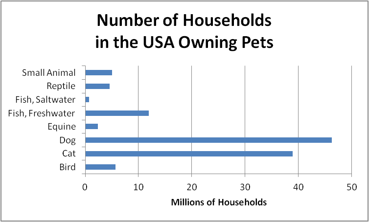
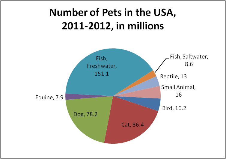
The National Pet Owners Survey is consucted by the American Pet Products Association on a regular basis. For the 2011-2012 survey, they obtained the following results.
| Type of Pet | Number of Households | Number of Pets |
| Bird | 5.7 million | 16.2 million |
| Cat | 38.9 million | 86.4 million |
| Dog | 46.3 million | 78.2 million |
| Equine | 2.4 million | 7.9 million |
| Fish, Freshwater | 11.9 million | 151.1 million |
| Fish, Saltwater | 0.7 million | 8.6 million |
| Reptile | 4.6 million | 13.0 million |
| Small Animal | 5.0 million | 16.0 million |
The number of households owning a pet (in the first column of the table) is qualitative data (and in particular, nominal data), but the total of that column would be meaningless, because some households will own more than one type of pet, and others do not own pets. In such cases, a bar graph is the most appropriate vehicle for displaying the data.
The number of pets owned (in the second column of the table) is qualitative data, and the total of that data would represent the total number of pets in the USA (except for the few households who might keep some more exotic pets). Pie charts are an excellent vehicle for displaying qualitative data having a total.
We could have constructed the first graph with vertical bars rather than horizontal, but it would have been slightly more difficult to determine how to place the text labels for each bar. And we could have displayed the second set of data as a bar graph rather than a pie chart, but we would have lost the sense of totality that comes with a pie chart. However, if we were displaying ordinal data rather than nominal, we would have avoided the pie chart, because the ordered structure of the data is lost in a pie chart.
Graphs are meant to be interpreted, and it is interesting to compare these two graphs. Dogs and cats dominate the first graph, but freshwater fish clearly form the largest sector of the second graph. The two graphs display different information, and in this case their differences alert us to the fact that fish owners own on average $\dfrac{151.1}{11.9} \approx 12.7$ fish each, while cat owners own $\dfrac{86.4}{38.9} \approx 2.2$ cats each.
The U.S. Census Bureau provided the following estimates of the annual income of individuals for the year 2008.
| Income Range (in dollars) | Number of Individuals (in millions) |
| 0 - 4999 | 20.353 |
| 5000 - 9999 | 21.476 |
| 10000 - 14999 | 21.981 |
| 15000 - 19999 | 18.801 |
| 20000 - 24999 | 17.742 |
| 25000 - 29999 | 14.941 |
| 30000 - 34999 | 14.078 |
| 35000 - 39999 | 11.895 |
| 40000 - 44999 | 10.447 |
| 45000 - 49999 | 7.994 |
| 50000 - 54999 | 8.963 |
| 55000 - 59999 | 5.136 |
| 60000 - 64999 | 5.921 |
| 65000 - 69999 | 3.909 |
| 70000 - 74999 | 3.961 |
| 75000 - 79999 | 3.139 |
| 80000 - 84999 | 2.886 |
| 85000 - 89999 | 1.806 |
| 90000 - 94999 | 1.910 |
| 95000 - 99999 | 1.278 |
| 100000+ | 13.215 |
This data is quantitative data (and more specifically, ratio data). Quantitative data almost always are either of interval or ratio type, and in both cases, pie charts should be avoided because they lose the ordered structure present in the data. Furthermore, rather than a bar chart, a histogram should be used to display the continuous ordering of the ranges for each bar. That is, a histogram has no gaps between bars, unlike a bar chart that does have gaps between bars. But if the ranges themselves have little relevance, then a line graph (frequency polygon) is probably more appropriate. For this example, we have shown both.
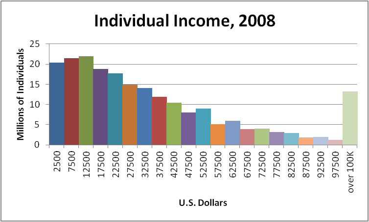
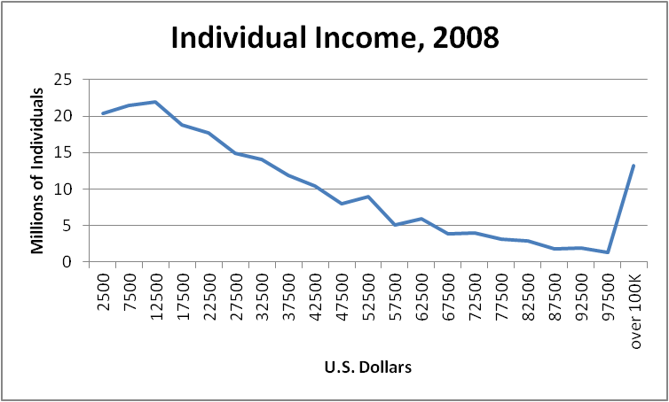
Looking at the result, we should probably discuss the last class. Note that the ranges in the frequency distribution all had width $\$5,000$, except for the last open-ended class. Unfortunately, that open-ended class does distort the graph. If we ignored that last class, the histogram would be misleading, because it would imply that no one earned more than $\$100,000$. But we could drop the last class from the line graph, leaving the end of the line hanging, and this does give the impression that there would be more data to the right, just not displayed on this graph.
Another useful type of graph is the cumulative frequency polygon (also called an ogive). Instead of using the frequency data as given, we find the cumulative frequencies and plot those instead. And in the following example, we also converted the cumulative frequencies to percents.
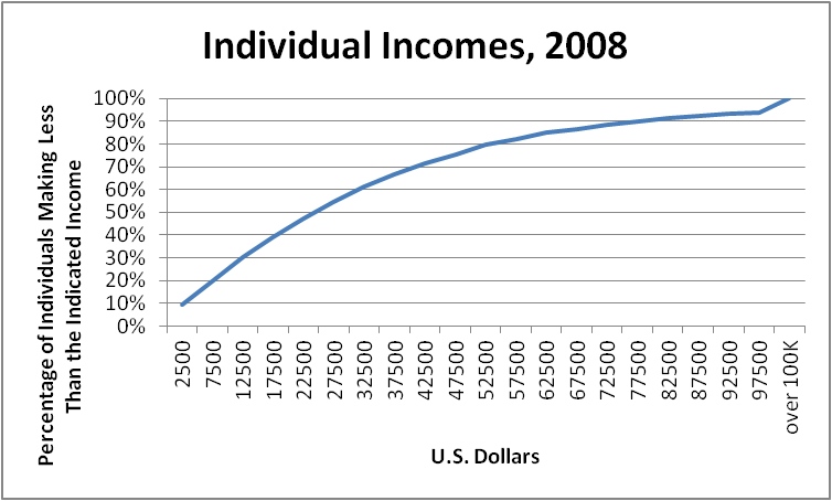
From examining this graph, we can easily see that the average (specifically, the median) income of individuals in the USA in 2008 was about $\$25,000$, and that an income of $\$75,000$ per year would place the earner at approximately the 90th percentile. We will discuss averages and percentiles in later sections.
Time Series Data will always have interval data (years, months, etc.) along one axis. Because of the continuous nature of time, a line graph (frequency polygon) should be used. Here are two examples of time series graphs. The first graph was prepared using data from the Center for Disease Control and Prevention, and the second graph, displayed on the CNN Money web site, shows the Dow Jones Industrial Average for the week of January 9-13, 2012.
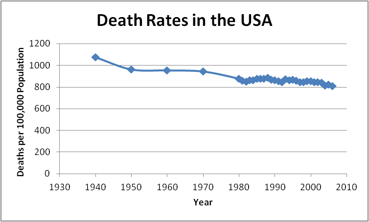
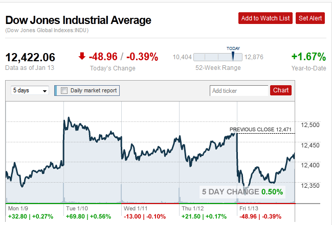
The first graph may appear rather boring, but in fact, it indicates that death rates have fallen over the past 70 years (which is a good thing for all of us who are still living). The second graph looks quite active, yet when the scales and the detailed information are examined, we see that it displays a really ho-hum week (with not much opportunity for making large profits on the changes in the value of stocks).
Bivariate data, where each data point consists of two observations, are typically displayed using a scatterplot. The following graph is a scatterplot of the winning and losing scores for the Super Bowl football games from 1967 to 2011.
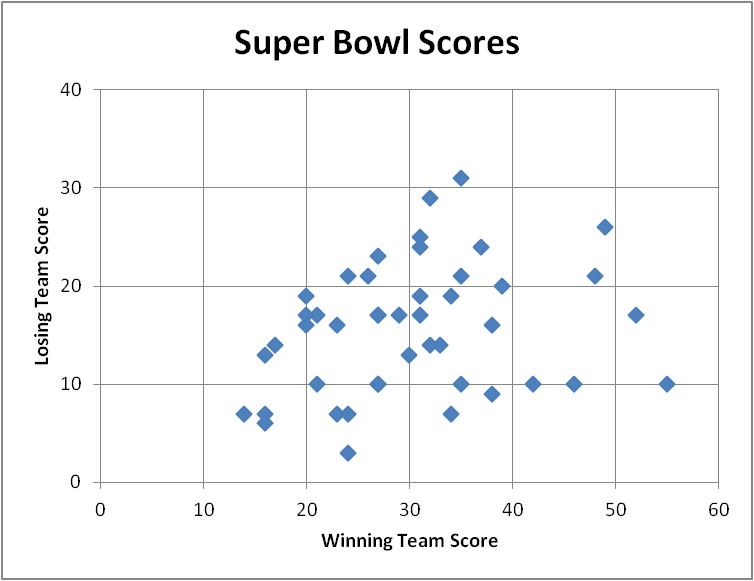
Since the winning score is always larger than the losing score, all of the data is closer to the horizontal axis than to the vertical axis. The games where the scores were closest are found roughly equidistant from each axis. We can see that there were a number of close games, but more frequently the scores were not that close.
Since graphs today are almost all made by computer software, we have not discussed the mechanics of putting one together. But if you follow certain principles, your graphs will have a much higher quality.
We make no claim that the graphs on this page meet all of these criteria. You should take the time to consider what improvements might be made to enhance each of these graphs.
We close with one last example, which must be viewed to be appreciated: Hans Rosling's 200 Countries, 200 Years, 4 Minutes, produced by the British Broadcasting Corporation for their program The Joy of Stats. Rosling's multivariate data effectively tells the story of the progress of global health in the last two hundred years.